Jun: Birthday, Rebrand & UI Redesign!
Birthday, Rebrand & UI Redesign!
nanos world Birthday 🥳
First of all, we would like to announce that this last week was the birthday of 3 years of nanos world under heavy development! Of course the idea of creating it is older than that.
It has been already a long time since we started working on it, and it has been a time of much learning for me and a lot of progress for nanos world!
I would like (again) to thank you all for the great support over all this time! I really love working on nanos world and love seeing you playing, using and creating on it! Making nanos world has become one of the great passions of my life 😍!
Rebrand
nanos world always has been about multiple worlds, more specifically YOUR worlds which you can express yourself and create the universe you always wanted to.
With the progress of the game development, it has become necessary to evolve in some aspects. When it comes to marketing, the main objective is to deliver nanos world to the right potential players and for this to be possible we had to rethink some things, and one of the things was to recreate our visual identity!
Our old identity lacked in some aspects regarding discoverability and professionalism, so we decided that it was time to make a new version of it! We know that it is possible that this is not yet the definitive version and it will be improved over time, however it's already a big step towards our short-medium term goals!
New Logo
For the logos we aimed to have something more minimalistic yet professional.
Since nanos world represents a wide range of game-modes and diverse worlds, we decided to create a new version of our current logo, with:
- 😮 A flat outlined style.
- 🤯 New title and the subtitle design & fonts.
- 😶🌫️ The ring became an infinity symbol bringing the sense of unlimited.
New Cover Art
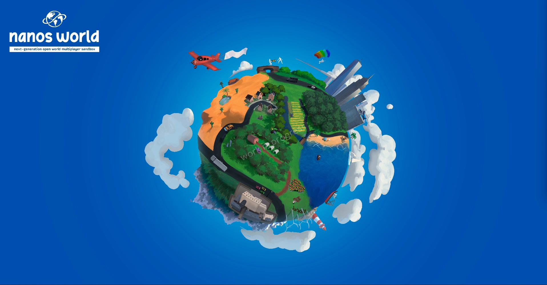
To express the idea of diversity, we are creating a new cover art to be used as Capsule Arts on Steam and of course to contribute to the visual identity!
So we idealized the creation of a living planet with many things happening representing the variety of game-modes in nanos world, as a Sandbox game should be.
This will be a huge image (8-16K), which each time you zoom in you will find something new (the full size image will be available in-game and on the website™ 😉)!
The Cover Arts are not final and are still in development by the artist™, some adjusts will still be made for the final version!
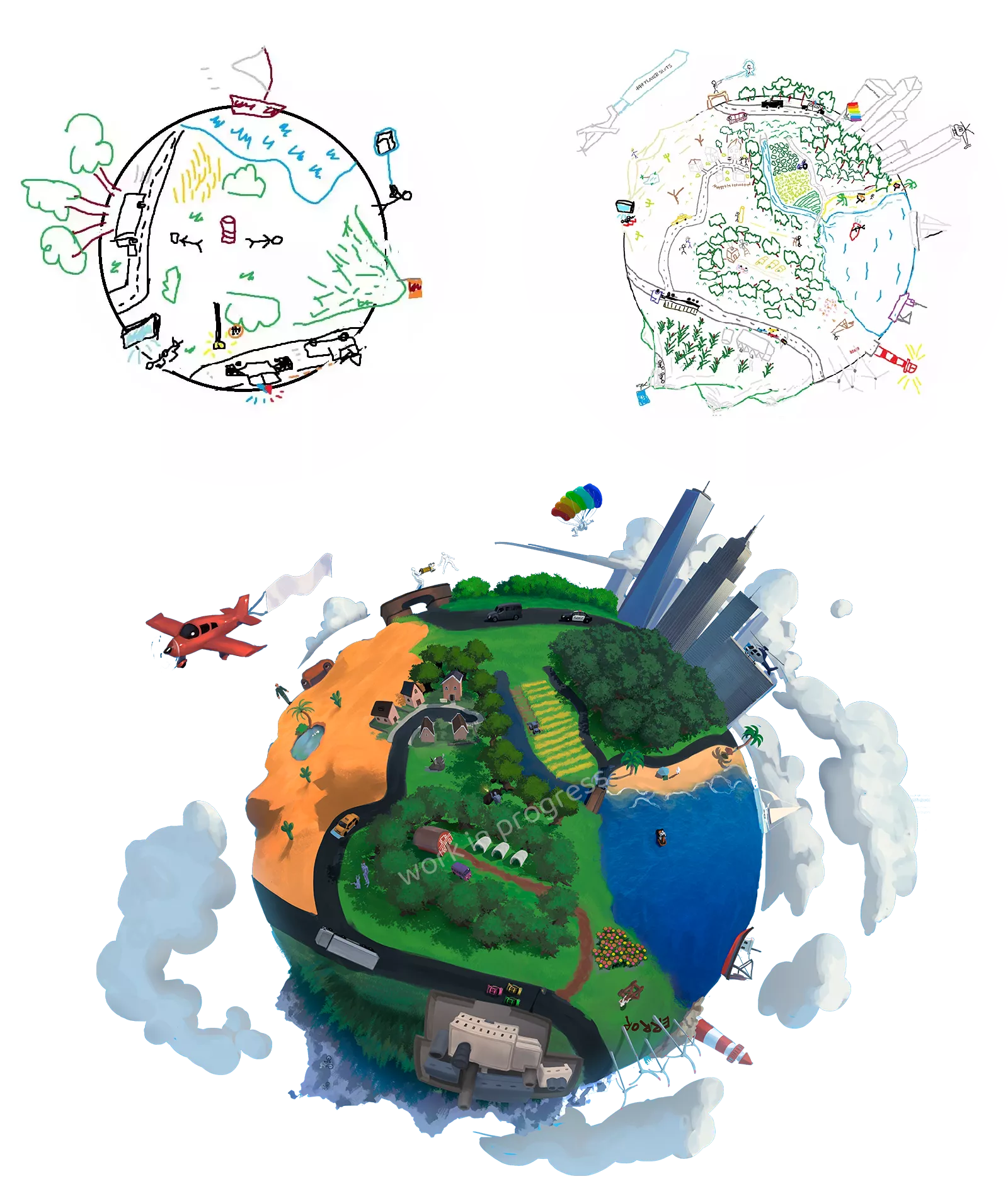
Some WIP Capsule Art sketches:
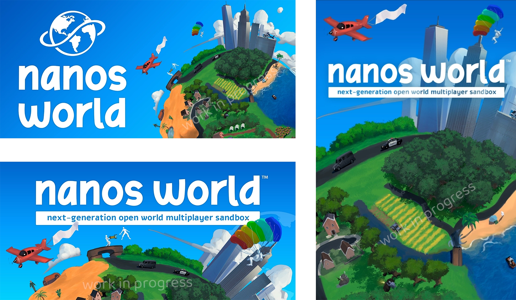
Credits to Pablo (PG Ninja) for creating the Art.
Motivation
A very important factor, even within Steam, is how your game promotes itself. And this happens due to two main factors: Capsule Arts & Steam Tags.
The Steam Tags determine whether or not your game will be displayed to the ones browsing Steam store. And the Capsule quality determines whether they will click on your game, Capsule Arts are the first thing seen by the shoppers, they appear in store browser list or when opening the game page.
Our current Capsule is this tedious screenshot with a simple text overlay 😅:
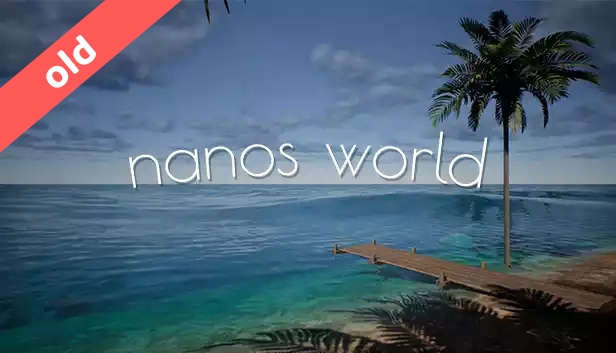
This is even extremely contraindicated because it shows amateurism and makes those who browse Steam unconsciously ignore it, in addition to the fact that the image does not convey the genre of the game, making those interested in sandbox games do not click on the page.
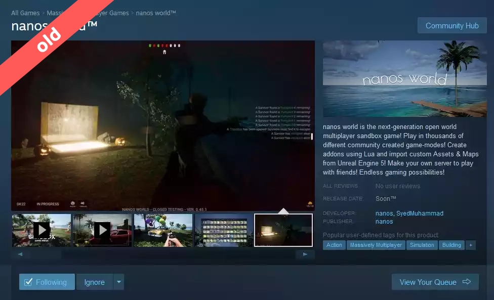
Then for this first version of our Cover Art we wanted to make it a little bit more professional and that at least minimally communicates the "Sandbox" genre.
Inspirations
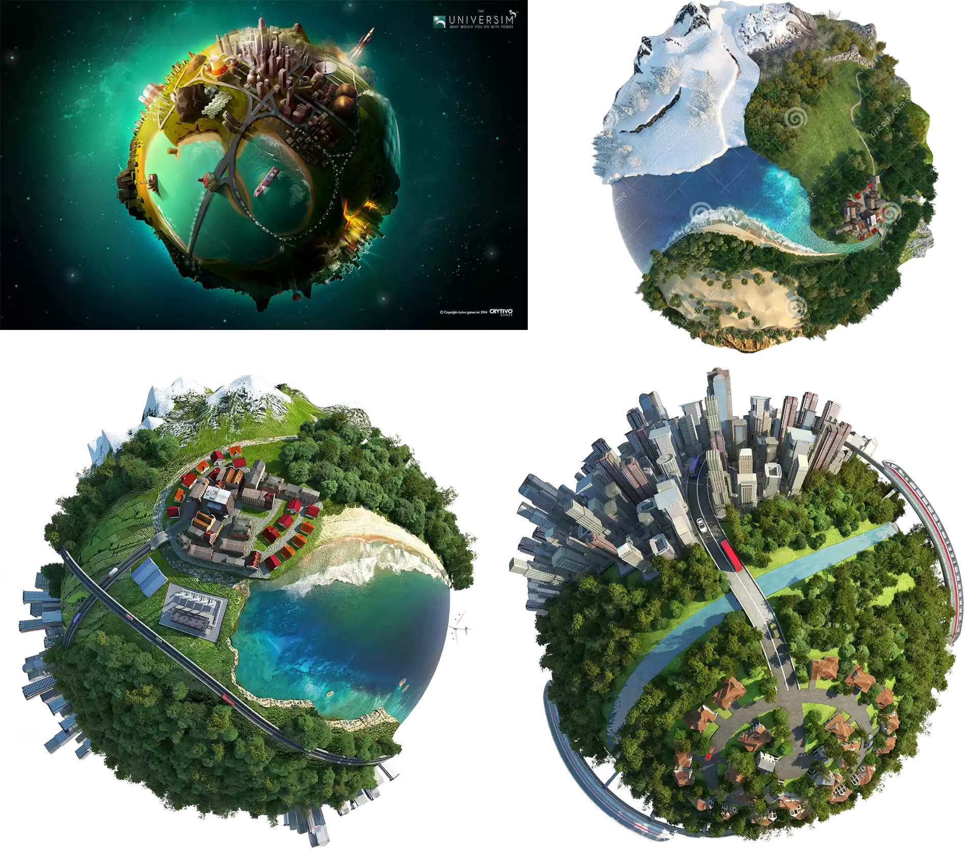
Our idea was to create an image of a living planet with various things happening, representing the variety of a sandbox game, so we got some inspiration from game arts and images that represent this idea, like the game Universim and some found stock images:
Sketches
Our creative process went through some sketches made in Paint, until reaching the current on-going version: 😜
Menu Redesign
In addition to the rebrand, we worked hard on redesigning the main menus of nanos world!
First of all, we would like to thank everyone who gave ideas and suggestions for the new design, especially Falaxir who created several threads of ideas related to it, which served as extreme inspiration for us to develop this new version!
Motivation
The main menu is the gateway for all players and the first impression when playing, it needs to be intuitive and to encourage the right actions to be chosen.
We take into account the following pillars:
- 🎮 Players First: It must take into consideration the common player as first, those who will choose a game-mode or just connect to a server to play and have fun.
- 🐣 Noob Friendly: It should be extremely easy and intuitive to start a new game or adding custom addons to it. Even those who don't know anything about servers should be able to easily start a game to play with friends.
- 🤏 Less is More: The User Experience must be the best possible. Buttons and Navigation must be intuitive without need of explicit tutorials or texts.
- 🍃 Fluidity: New pages must open immediately, no stutters should happen, filters should apply changes instantly, no desync between pages and data should happen.
- 🥰 Cozy Place: It must be welcoming, players must want to spend time inside the game, they must want to open the game to see what's going on.
- 🤩 Motivates Modders & Scripters: It must encourage content creators to create and upload to the vault.
- 📰 News should be exciting: Updates of vault items and even the game should be pleasant and exciting to read and to update.
- 🔍 Facilitated Discovery: New game-modes and content should be found easily, as well as the best ones should be praised.
- 🆕 Expand the Possibilities: The new menu should allow new horizons, it should be easy to integrate notification systems, lobby, favorites, etc.
Home Screen
In the old Home we had friends, achievements and news divided into separate tabs:
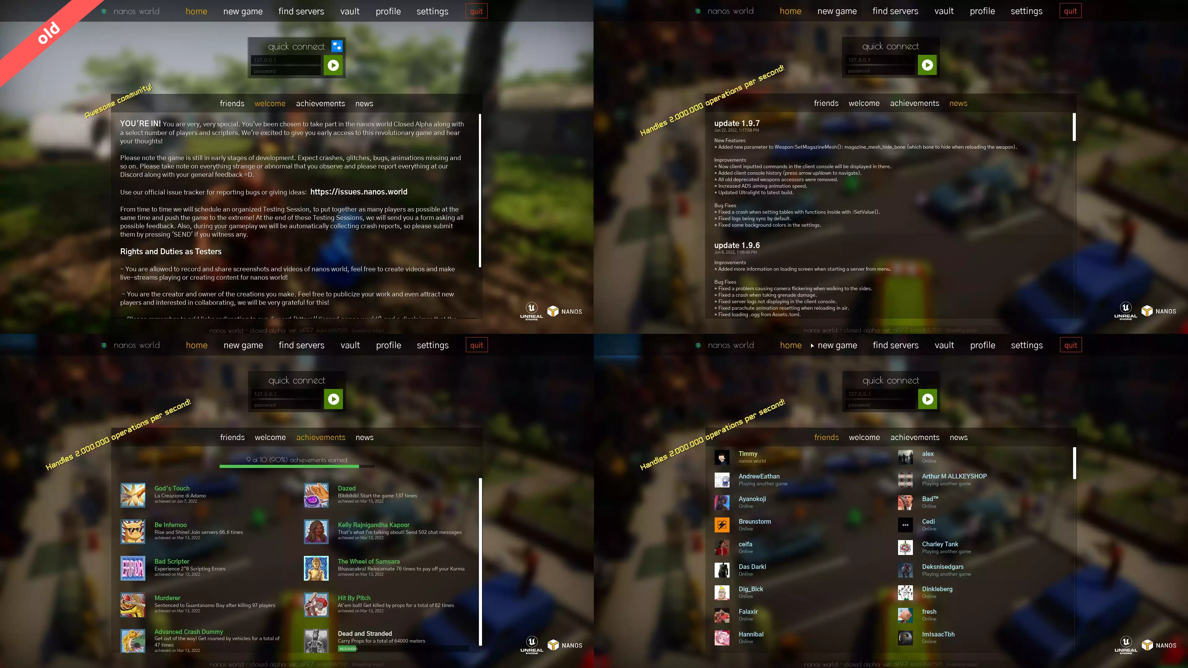
Before long we present the new Home page: a HUB where you can view a summary of your friends, your achievements, favorite servers, vault news and game updates!
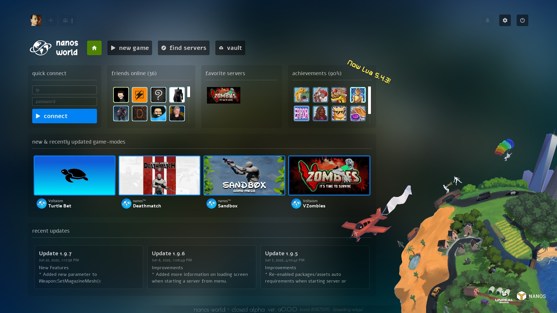
Some buttons and features are not yet enabled and will be available soon™. This initial version was aimed to contain all old features and some more 😉.
Vault
Our Vault was basically just for downloading/managing additional content, where it was possible to browse the store/remote and your local content and see a brief information about them:
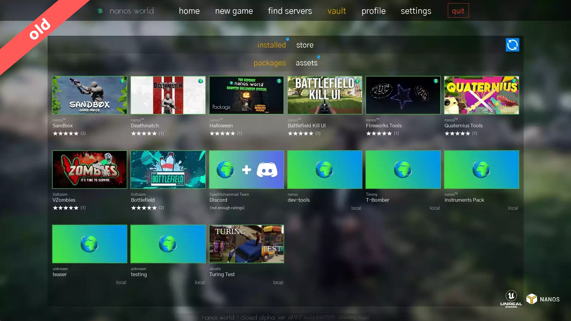
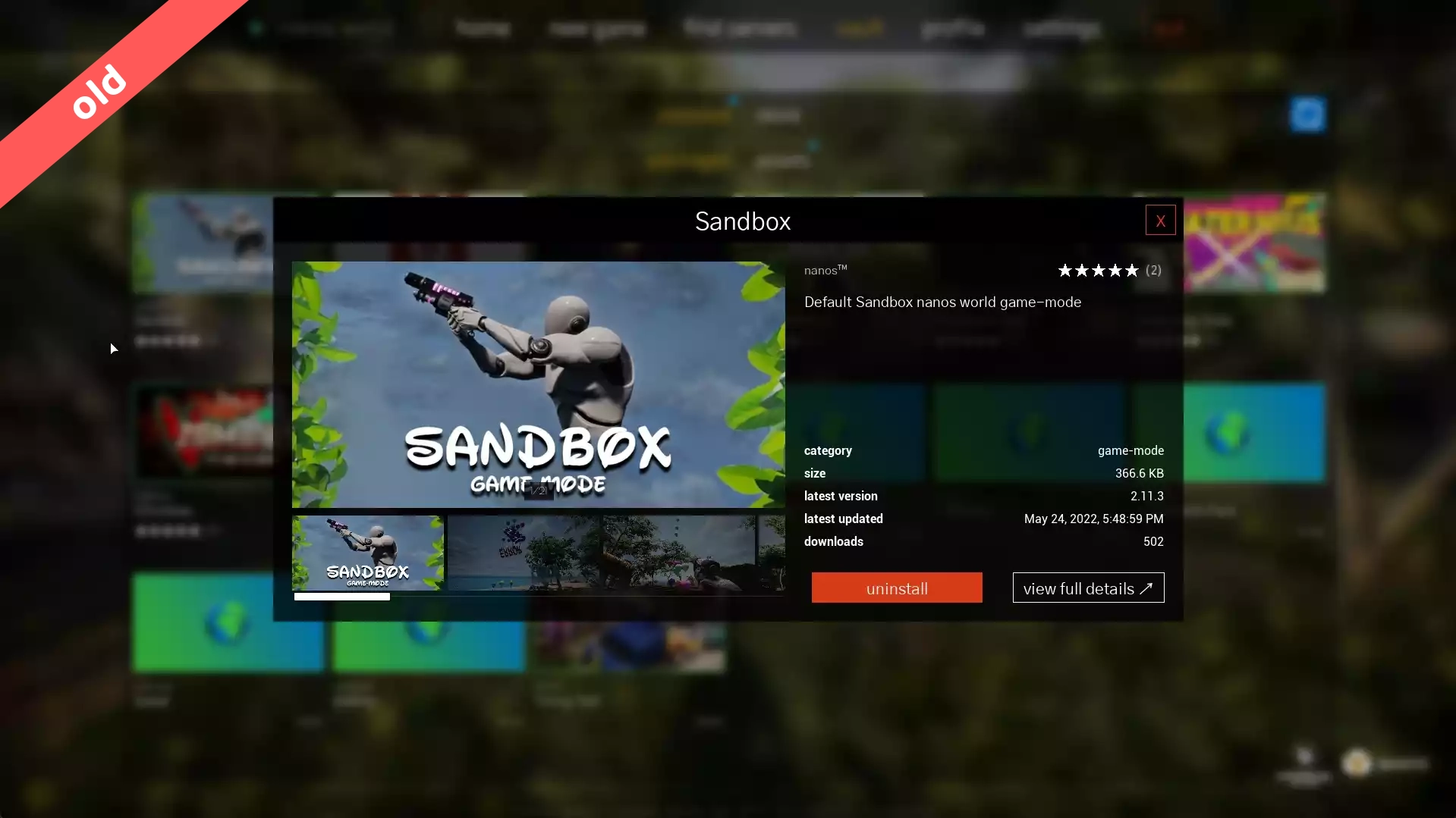
Now it has been redesigned for a completely new User Experience, providing filters and a new layout:
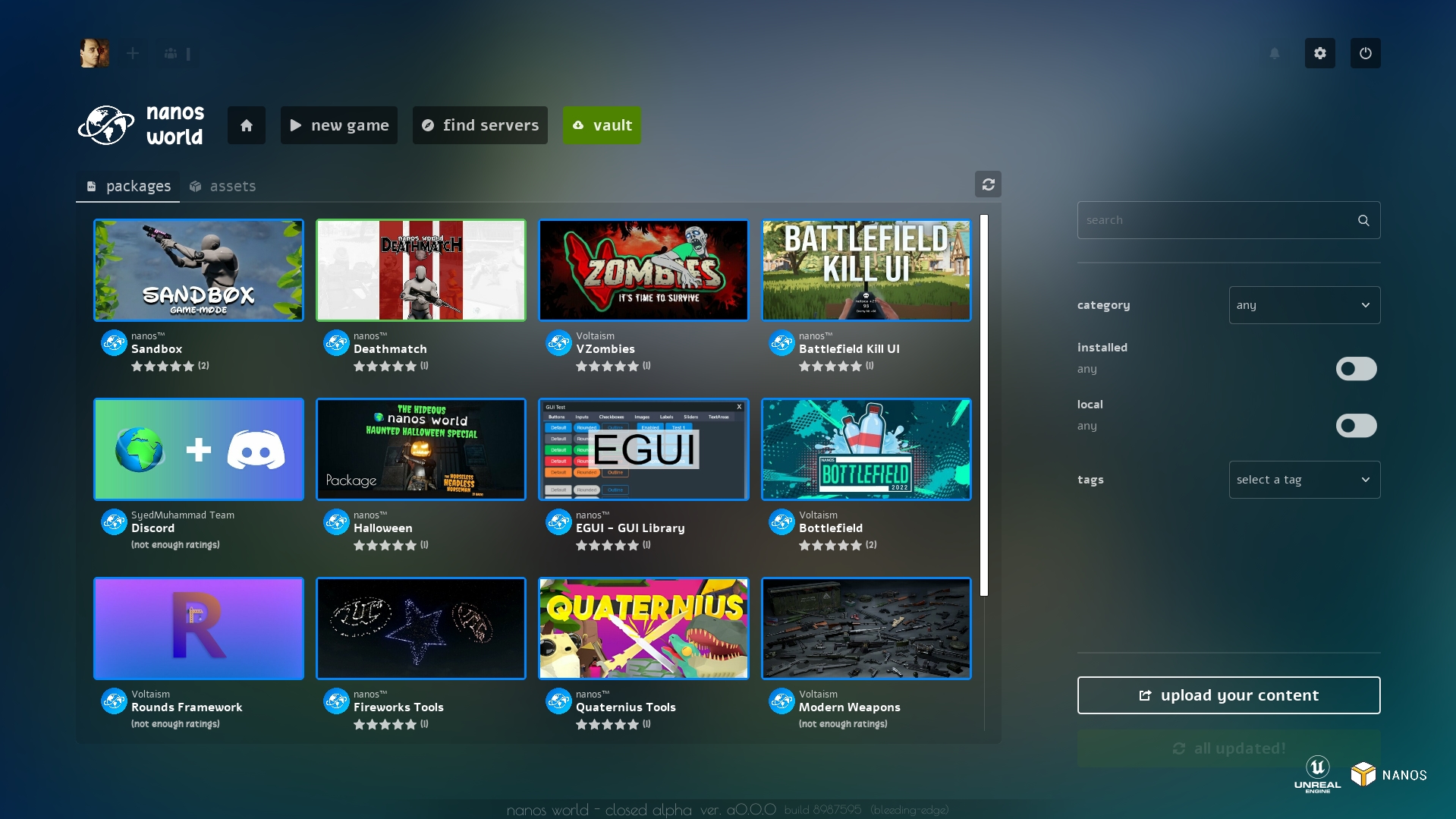
The new vault navigation, in addition to continuing to provide quick install/update/uninstall buttons, now also provides a quick Update All button, which updates all outdated items installed at once. Not to mention the improved performance and the interconnection with other pages and systems!
This new version has several optimization improvements, such as disk images caching or virtualized list visualization 😁!
Vault Details
We've completely rethought the Vault concept and created a new details screen, which will open when a Vault (or New Game) item is opened:
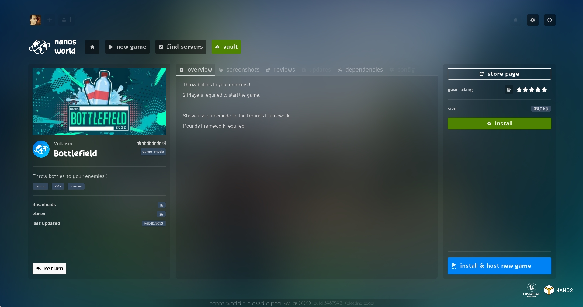
The purpose of this screen is to bring all possible information about the Package or Asset Pack: description, screenshots, updates, version, size, reviews, dependencies, and now the possibility of rating and soon™ configuring them through the interface.
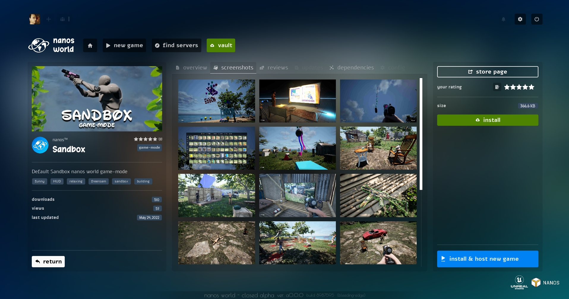
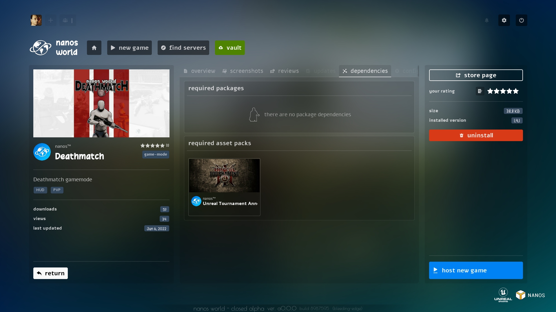
You can manage your review, the installation and updates on the right side!
And when selecting a game-mode, a Host New Game button will appear in the lower right corner, this will be explained better below on this blog.
New Game Screen
On the old New Game page, game-modes were separated into two different lists: installed and local, where it was possible to select one of the game-modes (or the "none" one) to start a server.
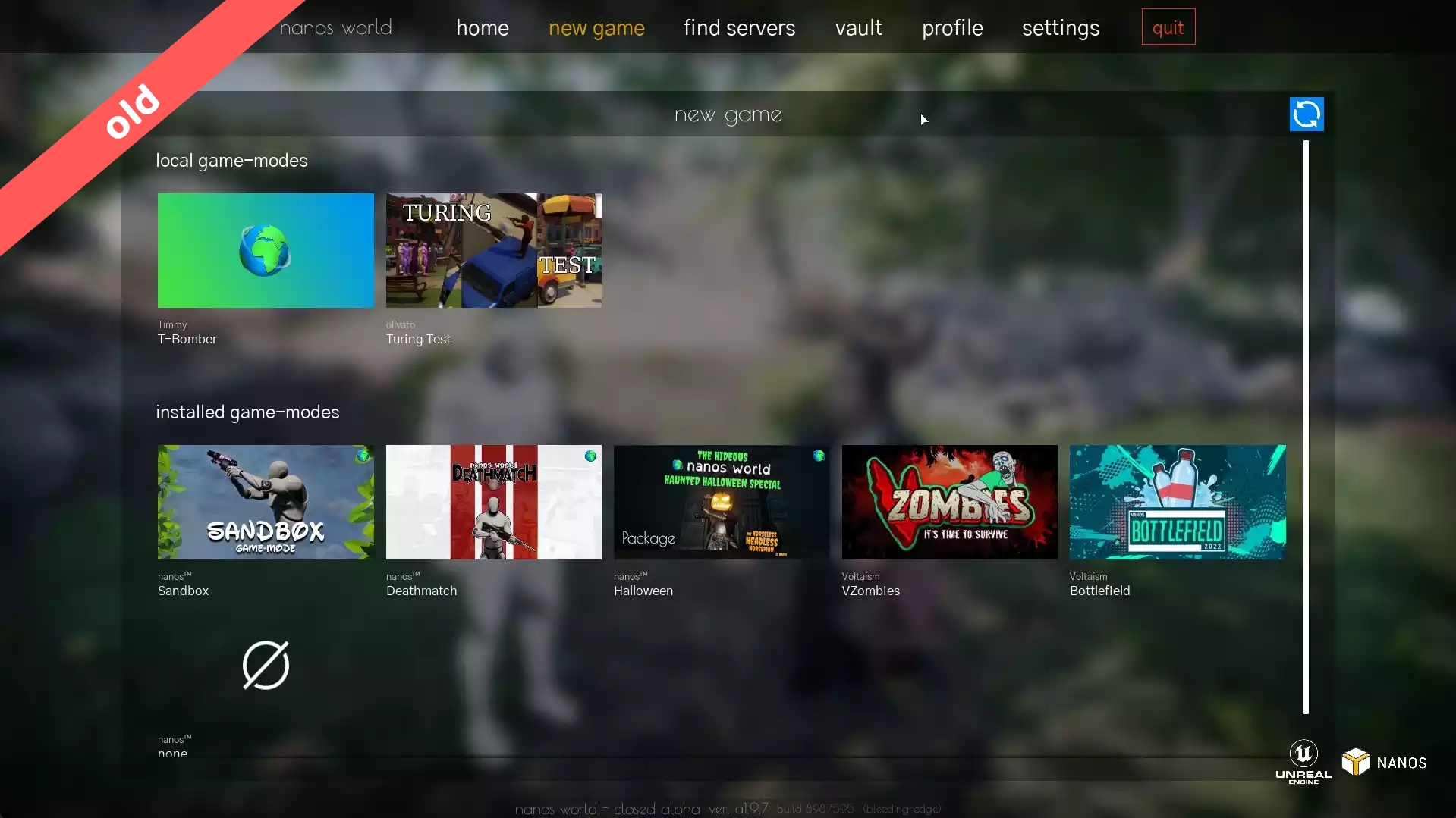
In the new design, the flow of New Game -> Selecting game-mode -> Play remains. But now we've got a new interface and filters, also it is now possible to order by popular, recently updated or top rating game-modes, and it is possible to filter them by name or by the filter toggles.
Also, now this flow allows you to start a new game even without having the package installed, removing the need to browse and install from Vault before!
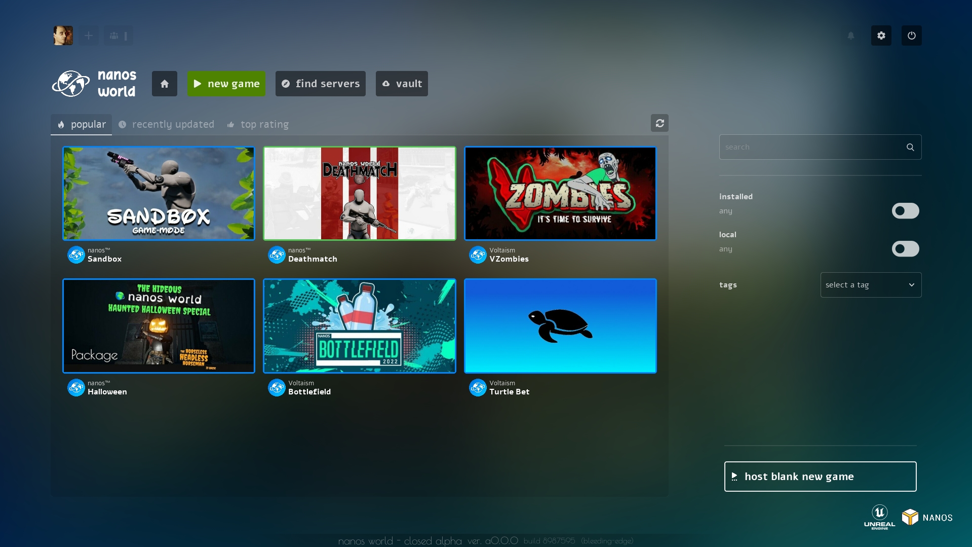
When selecting a game-mode, the same detail page will appear (just like Vault). And by pressing Host New Game, a Server Setup popup will appear:
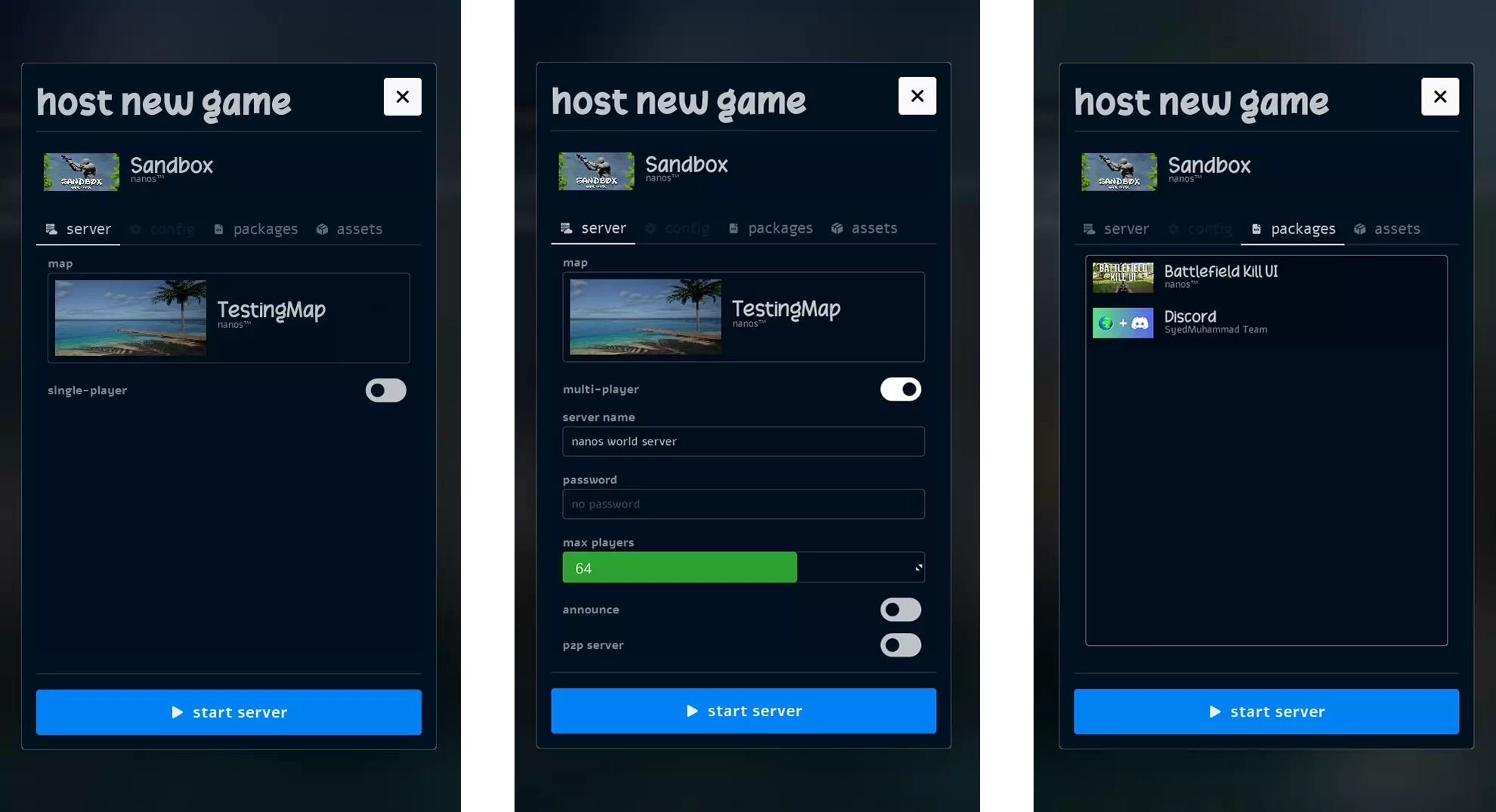
We created the concept of "single-player" game, which actually under-the-hood is the same server but configured to allow only one person and not announced at Server List.
We also improved the selection of additional Packages/Assets Packs, making the choice more functional and intuitive, you are now able to select multiple at a time before closing the selection popup.
The main idea of this new flow is to allow a new game to be created quickly, with less information required right away.
Soon™ we have plans to integrate a new concept of "game-mode" config, which each game-mode can setup it's own configuration before starting!
Find Servers
Find Servers's old interface was quite simple:
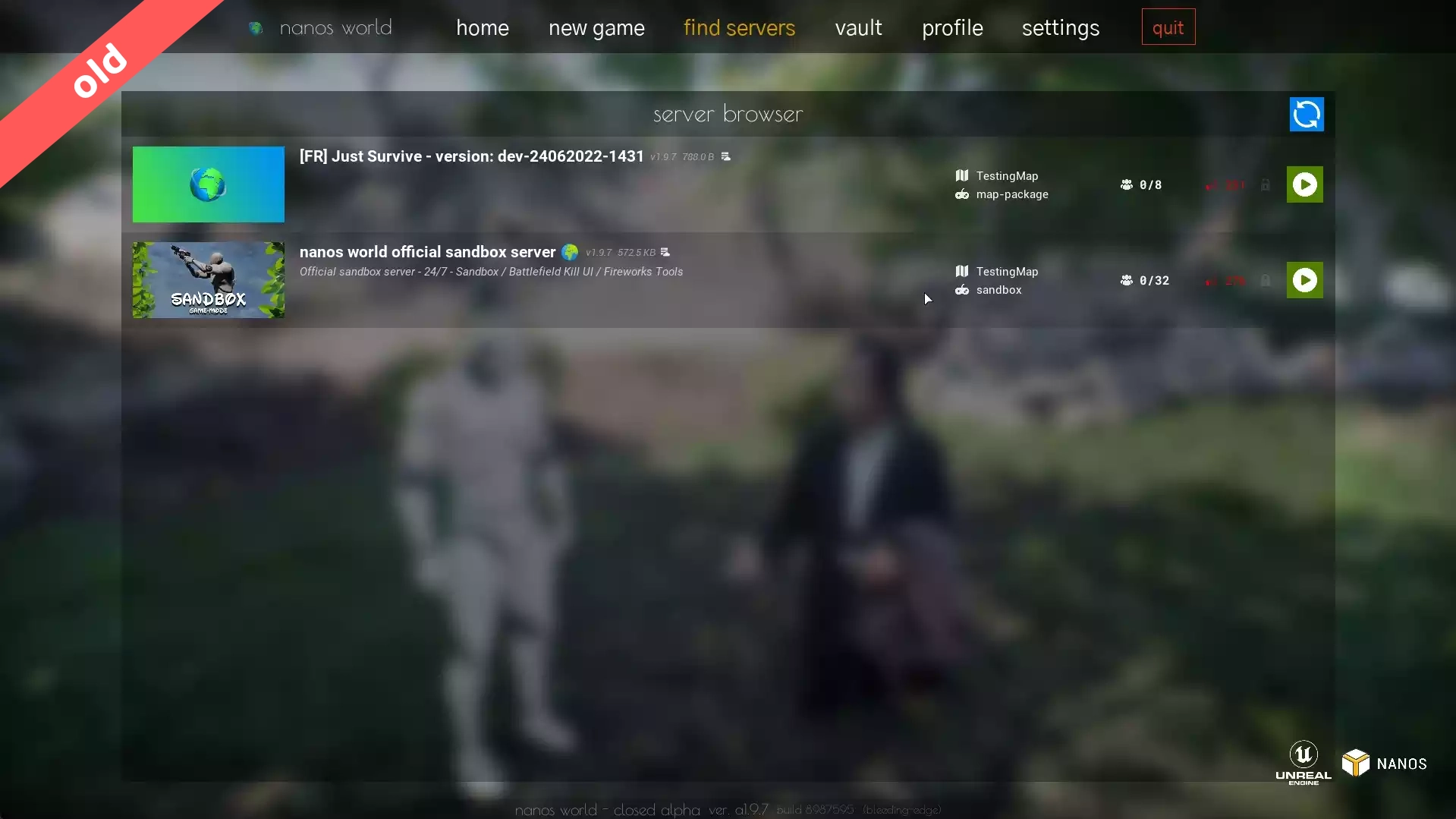
The new version got some improvements aesthetically and now we got custom filters and improvement of the buttons display (they only appear when hovered):
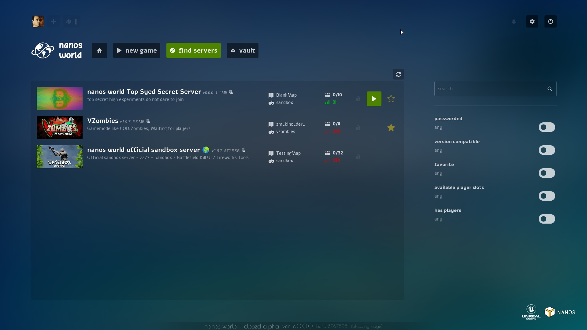
And now it is possible to favorite ⭐ a server!
Loading Screen
The loading screen was not left out! We reformulated it so you can have a real notion of the loading progress. Now besides the background color lightening as loading is near the end, there are 4 bars in the lower left corner showing every step needed for the loading to finish!
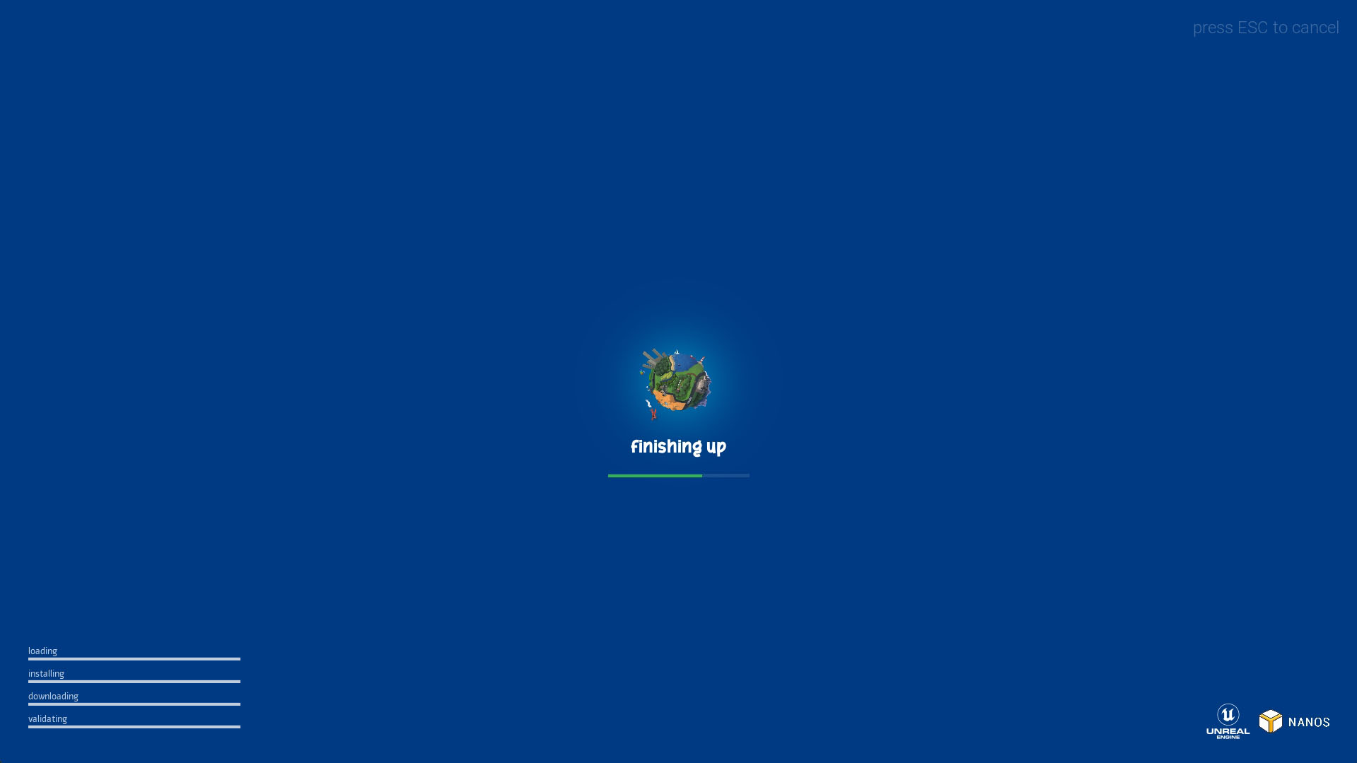
It is planned to have a further improvement on the loading screen, as now when starting a New Game we still don't have "much" information on the server startup progress.
Profile & Friends
We also got dedicated screens for your profile and to see your friends. In this screen you will be able to see information from someone or to follow him into a server.
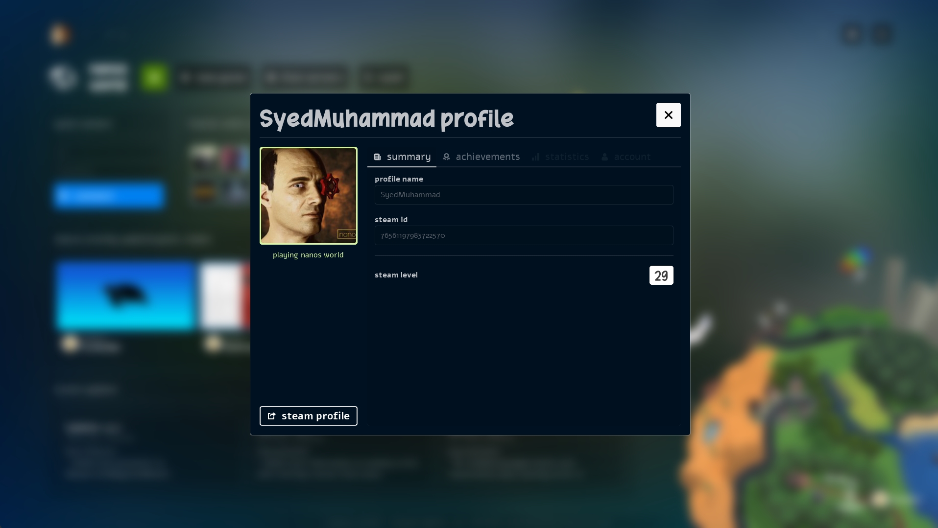
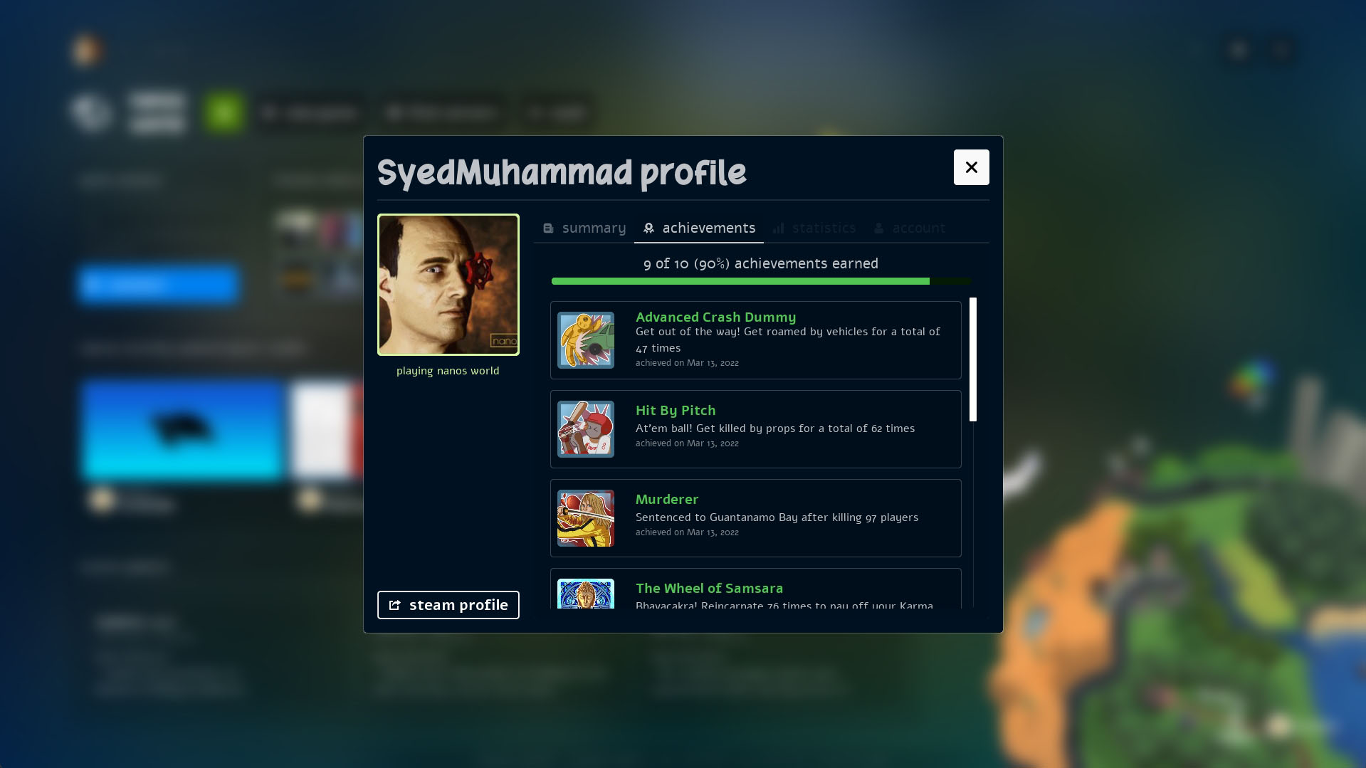
By clicking on your own profile, you will™ have access to additional tabs like Achievements, Stats and soon Account Config as well!
Conclusion
And this was just the beginning! You know that our evolution always has been very organic, adopting and adapting suggestions and new ideas to make nanos world the best modern sandbox experience ever! And that's what matters most for us!
If you have ideas or suggestions for improvement for both Logos and UI, feel free to make them in our Discord, we will be all ears for you!
Also, if you have content uploaded to the nanos world Store, please update it's description, screenshots and also your Team (now it supports image 😉) so it get prettier in-game!
We will push this blog updates to the game and all official pages as soon as possible in the next days, stay tuned!
Thank you for the support and dedication for this month! 🥰
